A look inside the workbook
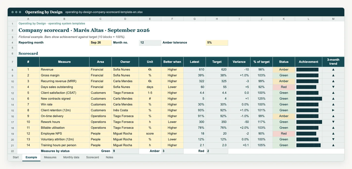
What it is and what it is for
A company scorecard gives leadership a one-page, top-level reading of business health. Drawing on Balanced Scorecard thinking, it groups ten to fifteen measures into four perspectives: financial, customers, operations and people. Each measure has a monthly actual against target, an automatically calculated RAG status and trend bars that show direction without complex charts. It helps keep management from looking only at the financials.
Who uses it and when
CEOs, founders, leadership teams and boards who want a balanced view of performance. Each measure has an owner in the leadership team; whoever coordinates management reporting or finance consolidates the scorecard each month.
Update the scorecard once a month, after the close, and use it in the monthly business review and board reporting. Review the measures and targets once a year or when the strategy changes.
How to use the template
- 1.Choose two to four measures per perspective, ten to fifteen in total. Each measure should link to a strategic objective.
- 2.For each measure, write the definition, the data source and the owner.
- 3.Set the monthly target and the thresholds for green, amber and red in the yellow cells.
- 4.Update the actual each month. RAG status and trend bars are calculated automatically.
- 5.In the meeting, start with measures in red and those that have been worsening for several months, even if they are still green.
- 6.Once a year, remove measures that no longer drive decisions and add those the new strategy requires.
Data access and limitations
RAG status depends on the thresholds you set; record them and keep them stable so colours can be compared month to month. People measures should be shown in aggregate, without identifying employees. The Marés Altas example is fictional and its values and targets are not market benchmarks. The file contains no macros.
Common questions
What is a company scorecard?
A single page of a few measures that summarise company performance across several perspectives, such as financial, customers, operations and people, each with a target, an actual and a status.
How is a scorecard different from a KPI dashboard?
The scorecard is a balanced, top-level reading designed for leadership and the board. The KPI dashboard holds more indicators, more detail and serves day-to-day management.
What does RAG mean?
Red, Amber, Green. Each colour corresponds to a range against target that the company sets and records on the instructions sheet.
References and use
These are practical Operating by Design resources. Suggested cadences and quantities are starting points, not universal standards. References consulted on 16 October 2026:
- Harvard Business Review · Kaplan and Norton, The Balanced Scorecard: Measures that Drive Performance (1992)
- Balanced Scorecard Institute · Balanced Scorecard basics
Adapt the workbook for internal use in your organisation. Preserve the source attribution. Avoid unnecessary personal data.
From template to implementation
If the challenge needs more than a template, leadership alignment and a cadence that holds, see how we implement this with teams.
Explore the related service

